Archive | November 2012

Project 3 Ideas and Website Analysis

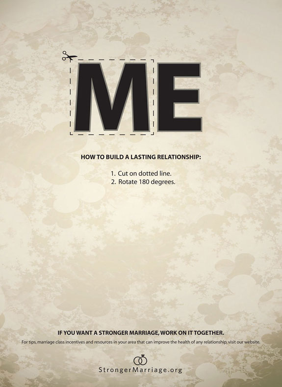
I would most likely use the map resume to complete project 3. One reason because I never heard of map resumes and I would like to try something new. I want the reader to know about the type of person I am the experiences and accomplishments in my life. I would add pictures/images of special times in my life and also text to explain the images/pictures. I would add images that better explain the person that I am and images of the times when I accomplished something.

The People Magazine Site (Below)

http://www.people.com/people/

Rhetorical Analysis

The purpose of this magazine is to inform people about what exactly celebrities are doing and where they were last seen. The audience of this magazine is young and older females that are interested in the celebrities and their whereabouts. I think the intended audience is young adults because some images on this website are handsome men and the question above or below the picture says the sexiest man alive. The probable reader would most likely be 18 and above (age), female (gender), students, bloggers, fashion designer or journalist (occupation), education (high school or college level). I can tell based on the images in the magazine because the images are I see on the page or of young adults, handsome men and celebraties with the latest fashion’s on. After reading the content on the page it promotes people to subscribe to the magazine and follow them on Twitter and like them on Facebook.

Design Element Analysis

The images on the page are working within the page because it shows the reader what celebraties are wearing and how they look, they use emphasis on the word People because it is the name of the magazine, it also uses color contrast to not bore the viewer, they also use bold lettering to let the reader know what the article is about, it also used size contrast to let the reader know what is important and what is not, the online magazine uses alignment to be organized and it also uses typeface as well.

Design and Rhetorical Analysis

The design elements meets the needs of the rhetorical element because the purpose of the online magazine to get people to subscribe to the magazine and pull the viewers attention by having different articles about celebrities and images to show people the latest fashion.

  • Copyright and attribution: The online uses the video to advertise TV networks like OWN, it uses images to catch the reader attention so that they can read the articles. The magazine use things like Facebook, Twitter, Instagram, and videos to promote the People magazine.

The Good, The Bad and The Ugly About Video Resumes

The good thing about video resumes is that is shows that the person has some technology skills. For example, if I was to ask my mother did she know how to upload a video to YouTube she would probably first ask me what YouTube is and then refer me to someone who she thinks will know. Another good thing about video resumes is that the person can be creative. Most people who haven’t been working for five or more years or even people who have can be creative to not bore the viewer.

The bad and the ugly thing about video resume is that everyone is not technology savvy as others. For instance, a manager who is age 50 has a successful business that makes tons of money but he doesn’t know how to use a computer because he hires people to handle the technology things. Another bad thing about video resumes is that they can be to long at time. The video resume should be short, sweet and to the point. One more thing is that technology fails and if you submit a video resume and the technology fails problems can arise.

Chapter 10 and 11 Fonts Thinking

I feel that bold letters will represent me because I like to be different and stand out and not do what everyone else is doing. I also will use serif because I like to be fancy sometimes. Things like color contrast and size contrast will represent me professionally. I would use color contrast to let my viewer understand what the purpose is and for size contrast I would use this to also let the viewer know what the purpose is and what I want them remember after reading what I created. I will also use emphasis in my text for the same reason.


Project 2

Creative commons licensed image.


Project Description

I feel that my project could help people who maybe are taking English 307 or people who are interested in exactly what is digital writing. The purpose of this project is to inform people about what digital writing is. The audience is college students who are interested in what digital writing is and  normal people who are interested in what digital writing. For my picture that I used I added text into the screen, I used the burn option to darken the background a bit and I highlighted the computer. I didn’t use any source in my audio postcard that required me to cite because my audio was about what I thought digital writing was to me. The audio file in my project talks about computers, cell phones and email is closely related to digital writing. Also, my image has a computer, a phone and books which are related to digital writing.

Reflective Letter

I am proud that I completed the project and the fact that I actually made a video and put it on Youtube! I wish I had more time to talk about what I feel digital writing is. I used Audacity for the audio, Photoshop to edit the image, Windows Movie Maker to put the audio and image together and Youtube to publish the video and they were appropriate because they all helped me with my final product which was to make a video with one image and audio. I wish I had more time to revise the content in my video. I got stuck when trying to put the audio in Windows Movie Maker and I continued to work with it until I found out how to do it.

Robust Note Taking 11/10/12 (Online Idenitity)

The Perfect People Meter

Lee Rainie, Director of the Pew Research Center’s Internet & American Life Project said, “The digital world continues to evolve still and we are just beginning to watch and understand another large-scale change as the “internet of things” is coming into being … and the environment itself – the rooms we inhabit, the cars we drive, the appliances we use, the things we wear – all those things are becoming connected and data-rich nodes of digital media.

Cisco has predicted that by 2013 the amount of traffic flowing over the internet annually will reach 667 exabytes – that’s more than 44.55 million versions of the Libraries of Congress.

The impact of Revolution 1 – the internet and broadband revolution (More people involved in online things like looking at videos online or logging into computers to explore internet and publishing and broadcasting on internet.

Revolution 2 is the mobile revolution. There was an increase in the use of cellular devices and use of cellular devices to use the internet as well.

Revolution 3 is the social networking revolution on technology. More people used social media networks like Twitter, Facebook or Friendster.


Key Terms

Purchase Data: We not only have data about who buys what; we also now have information about who *almost* buys what (abandoned carts), *when* they buy, in what context, and so on.

Search Data: The original database of intentions – query data (as Battelle says, “what I want”) path from query data, and many more search signals.

Social Data: Who’s your friend and personal tastes data.  (Battelle describes it as “Who I am”)

Interest Data: This is data that describes what Battelle and others generally called “the interest graph” – declarations of what people are interested in. It’s related to content, but it’s not just content consumption. It includes active production of interest data points – like tweets, status updates, and checkins.

Location Data: This is data about where people are and information about how often they are there, what apps they use when they are there, and who else is there and when.

Content Data: Knowing patterns of content consumption is a powerful signal. This is data about who reads/watches what, when, and in what patterns.

Wildcard, Miscellaneous Data: Applications use data, email traffic, time-use material known by carriers, individual server side data that companies have.


Discussion about People Meter

Things have changed from people not using broadband internet as much to people using it every day. Also, we have come as far as people not using cellular devices to people who use and have cell phone. Another thing that has changed is the use of social networks like Facebook and Twitter. There are many ways to meet people but the most common way to meet people in the 21st century is by internet, cellular devices and social networks.


I Flunked My Social Media Background Check, Will You?

Employers can look at things like social networks to see if they want to hire or not hire a person.

They look for embarrassing photos to pass to employers and also look for things like discrimination, sexual explicit activity because they want to know if the person that they hire will or will not cause them legal hassle.

You have to put stuff on your resume that won’t hurt you (job wise).

Discussion

This article really made me open my eyes and realize that I need to be careful what I put on my Facebook and Twitter page. Also, by employers looking at the activity on a person’s page it teaches a person watch what you say and do on the internet.


Managing Rep

 Think Twice

The number one thing to do is to watch what you put on the internert

 Tackle Source

If you find yourself in a sticky situation dealing with the internet you have to remove contact sites webmaster if you can’t remove it yourself.

Protecting Rep Video thoughts

I learned a lot of things from this video. For example, I didn’t know that things that you share on the internet can last forever. Also, the internet scans pages so that when a person types something in the search engine they can find it. I didn’t know that a page that is scanned can last forever even if you delete the content on the page.


Works Cited

Rainie, Lee. The Perfect People Meter: My Beautiful Fantasy About Understanding Audience in the Digital Age. 2011. Web.

Honan, Matt. I Flunked My Social Media Background Check, Will You? 2011. Web.

Moskwa, Susan.  Managing Your Reputation Through Search Results. 2009. Web.

Rhetoric on the Town (Classmates Rhetoric on Town Work)

BALANCE

http://nzewd001.students.digitalodu.com/?p=77#comment-73 

In this photo he explains that though the bottle it cut up into slices of tomatoes that are balancing on top of each other the image has balance which is not only clever but is correct.

http://www.lglos001.students.digitalodu.com/?p=106

I like that you said that the audience of this advertisement is not only hungry people but couples and groups of people. The image not only shows balance but it also shows repetition (yellow coloring in food, the free entree item text and the yellow coloring down at the bottom.


Alignment

http://nzewd001.students.digitalodu.com/?p=88

This is an ad about domestic violence. Reading my classmates thoughts on this ad really made me realize that alignment doesn’t always have to be items that are straight up and down on a page but it can be also be side to side or curved on a page as well.


http://vsimo001.students.digitalodu.com/?p=170

After reading my classmates thoughts on this ad I agree that this image does have good alignment. The ME and the other text is not exactly in the middle because that would make the top of the ad blank.


Contrast

http://vsimo001.students.digitalodu.com/?p=168

Reading my classmates thoughts on this ad made me realize that the audience isn’t people who like and use the services of Beeline but it is the young people who use these products the most.

http://nzewd001.students.digitalodu.com/?p=84

My classmate said that the contrast in this photo is colors and I agree my classmate also said that they use the colors pink and blue to make a bold statement to attract the viewer.

Rhetoric on the Town (Flow)

Creative Commons image on Flickr

Rhetorical Analysis: The audience of this advertisement is young adults. The purpose of this image is to get people to buy and drink more Coco Cola. I think the intended audience for this advertisement is young female adults.  I know the purpose of this image because the young lady is holding the Coca Cola and the word Coca Cola is red letters is the first thing I looked at in this image. After viewing this advertisement the view would most likely go out and buy a Coca Cola.

Design Element Analysis: This image shows emphasis on the word Coca Cola. It also shows (flow) because the young lady is leaning on the word Coca Cola. There is also repetition the color of her shoes and the color of the bottle of Coke. This advertisement makes the viewer feel if they drink Coke that they will not lose their figure and they will stay young looking. Also, flow helps to viewer know what the purpose of the ad is and the way the Coca-Cola sign is  seems to be leaning just like the women showing that Coca-Cola may relax you as well.

Rhetoric on the Town (Alignment)

Creative Commons image.


Rhetorical Analysis: The audience for this advertisement is people who like Nike products and people who live on the edge (young people). The purpose of this advertisement is to promote Nike (all products by Nike). I know the audience for this advertisement because of the words Just Do It and most of the time young people do not think they JUST DO IT. Also, I know the purpose is to get people to buy Nike products because of the checkmark logo that Nike uses on all their products. After reading this advertisement the viewer would most likely buy the product(s).   

Design Element Analysis: The words in this image are perfectly aligned and the first thing that your eyes are drawn to is the pink Nike sign (Contrast). The words in glass tell me that this advertisement is made for people who aren’t scared to live life to the fullest. Also, the fact that the words JUST DO IT is all in capital letters makes a person think. For example, if a person wanted to buy a pair of Nike shoes and they couldn’t decide if they wanted to get the expensive shoes that they like or the less expensive shoes they really don’t like the words JUST DO IT may make a person think twice.  

Rhetoric on the Town (Contrast)

 Creative Commons licensed image.


Rhetorical Analysis: The purpose of this advertisement is to get people to purchase Oreo cookies and milk as well and the audience would be people who love or like cookies and milk together. I know the audience is cookie and milk lovers because the milk is positioned right beside the cookies (hardly any space in between the two items). The intended audience in this advertisement is most likely young children because most children eat cookies and milk together. This image is promoting the viewer to try milk’s favorite cookie which is Oreo’s.

Design Element Analysis: This advertisement is advertising Oreo cookies and therefore the emphasis is on the word Oreo. Also, if you look at the blue around the Oreo Milk’s Favorite Cookie it almost looks like the cookies and milk are pushed back slightly to draw the audience’s attention to the Oreo logo (contrast). The word Oreo seems to be pointing to the cookies and milk and the way it is positioned tells me that cookies and milk may be slightly pushed back in this image (flow). The background which is showing contrast does work rhetorically with the image because since the background on one side is blue and the other white the blue side (text) seems to be pushed out more and therefore showing the viewer what the purpose of the ad is.